
Strong Slice
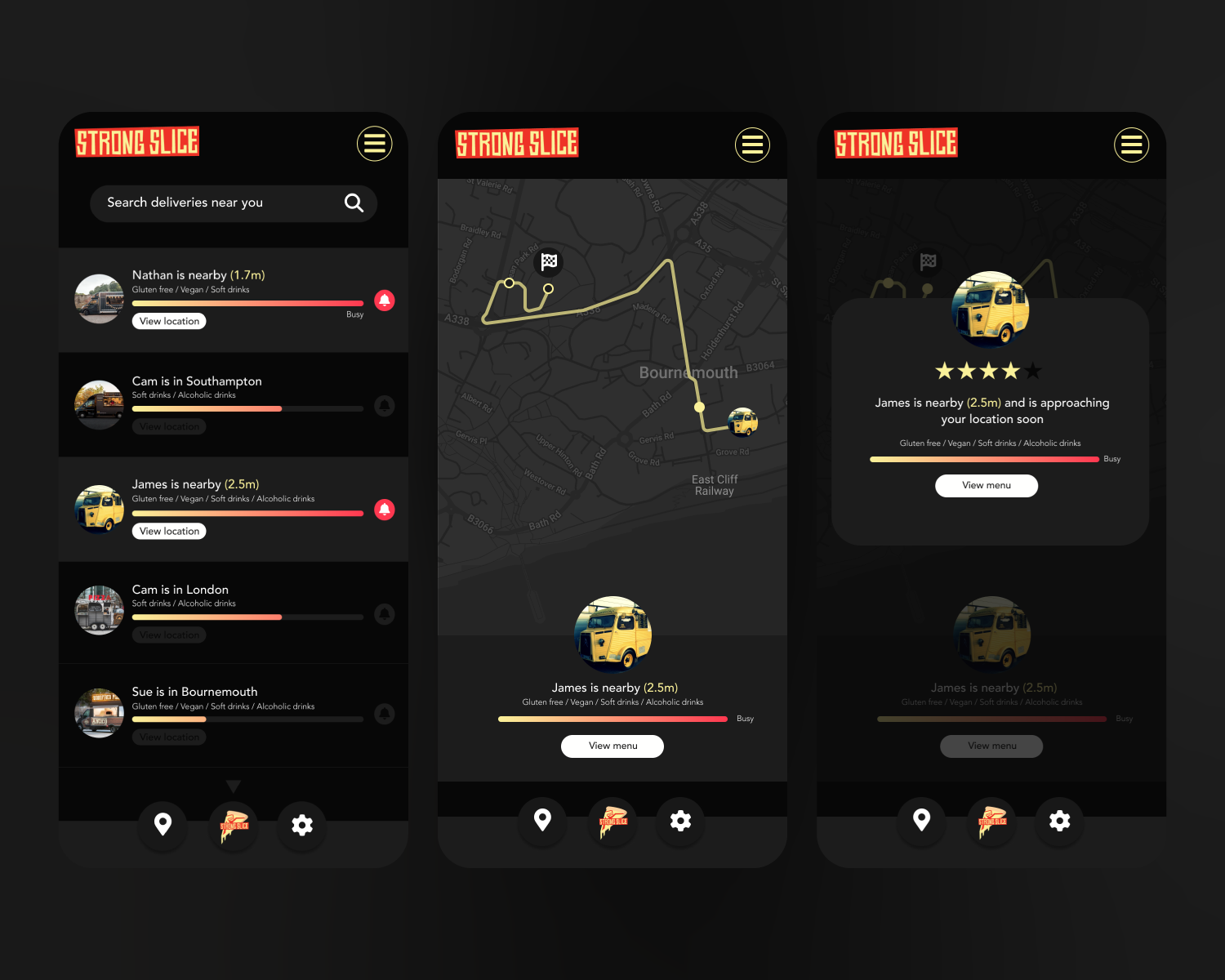
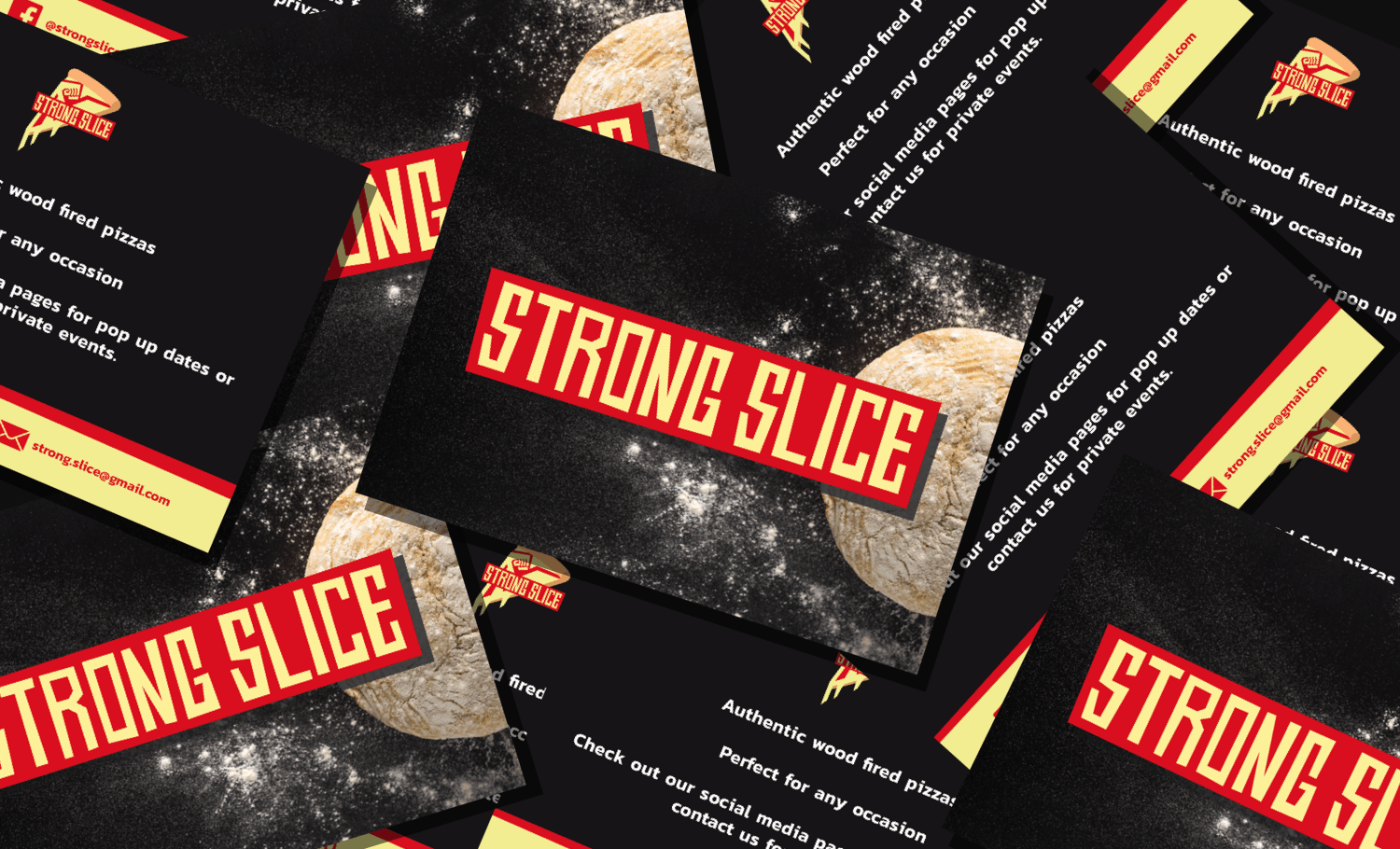
Brand Identity / Social Media Assets / Menus / Flyers
The goal was to create a bold & authentic brand for a close friend’s pop up pizza company called Strong Slice. I took inspiration from the legendary American graphic designer Saul Bass. I wanted to somehow incorporate a subtle nod to the name by including a tensed bicep and fist to the tomato and cheese base of the pizza. The “nod” needed to be as subtle as the bear within the mountain like in the Toblerone logo or like the arrow within the FedEx logo. I was really happy with the end product of the logo and the project was completed with ease from start to finish.

“We would highly recommend J.R.Dickie for all your creative design needs, he has provided us with a great new logo for our start up business also providing us with menu & flyer designs. We gave him an idea and he put his creative spin on it to produce something that is perfect for our business.”
Nathan Strong - Co-Founder of Strong Slice